Accessibility is important. Let’s do something about it.
Hi! I’m Ally Palanzi.
Senior Front-End Engineer @ Vox Media
allypalanzi.com/a11y/slides
Accessibility (a11y) refers to the design of products, devices, services, or environments for people who experience disabilities.
In 2001 the World Health Organization redefined disability as: “a mismatch in interaction between the features of a person’s body and the features of the environment in which they live.”
Our work can create or remove mismatches in interaction.
The impact of disability is radically changed on the Web because the Web removes barriers to communication and interaction that many people face in the physical world.
W3C AccessibilityBy designing with disabilities in mind, we create better products for everyone.
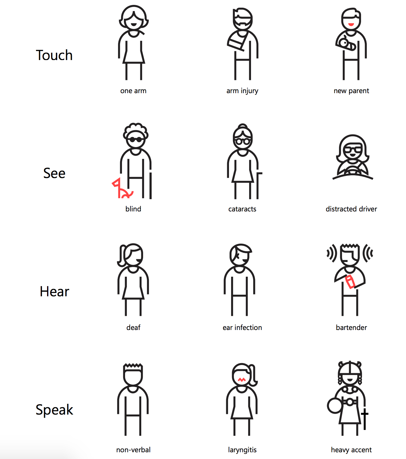
Disability affects all of us at some point.
- Permanent
- Temporary
- Situational
Ok, but why should we care?
a.k.a. what to tell your boss
It’s better for business
- Device independence
- Usability
- Design for older users
- SEO
Case studies show that accessible websites have better search results, reduced maintenance, and increased audience reach.
W3C Accessibility OverviewAccessibility supports social inclusion, allowing us to hire more diversely & reach a diverse audience.
Scary legal things!!
Many countries are recognizing and acting upon the need to ensure access to the web for people with disabilities.
Web AimA common approach throughout the world is for nations to adopt the Web Content Accessibility Guidelines.
USA 🇺🇸
Section 508 of the Rehabilitation Act means that all users, regardless of disability status, can access technology.
Australia 🇦🇺
World Wide Web Access: Disability Discrimination Act Advisory Notes requires equal access for people with a disability where it can reasonably be provided.
Europe 🇪🇺
EU Charter of Fundamental Rights Article 21 prohibits discrimination based on grounds of disability, among others.
...and more!
WebAIM World LawsAnd if this still doesn't convince your stakeholders...
Ask for forgiveness later
How we’re solving a11y at Vox Media.
Our foray into accessibility didn’t really get started until May 2016.
We’ve always had advocates for a11y.
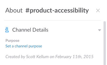
An accessibility slack channel was created in early 2015.
Lots of talking.
Two Days
- Brainstorming
- Speaker
- Documentation
- Planning
We wrote a lot of docs!
Our Guiding Principles
People want to access our content and use our tools; let’s make it easy for them.
We don’t make assumptions about our users.
This is where the industry is going. Get on board or get left behind.
Accessibility is everyone’s responsibility.
We shared internal guidelines
We ran knowledge shares
We began to incorporate it into every project
Keeping people accountable
- Integrating accessibility into QA process
- Treating it as any other feature in a project
- Celebrating wins!
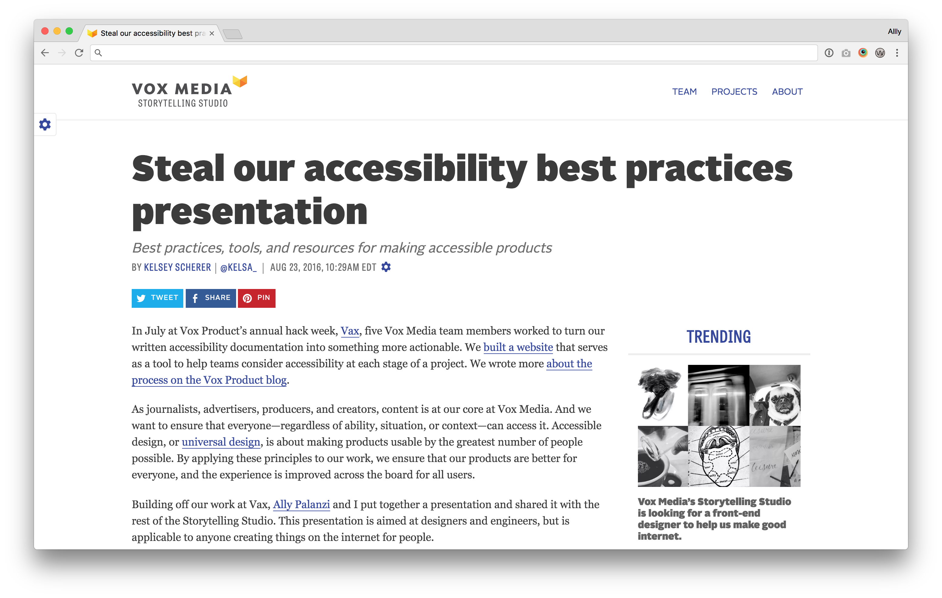
How can we share them with the world?
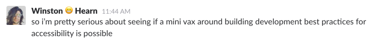
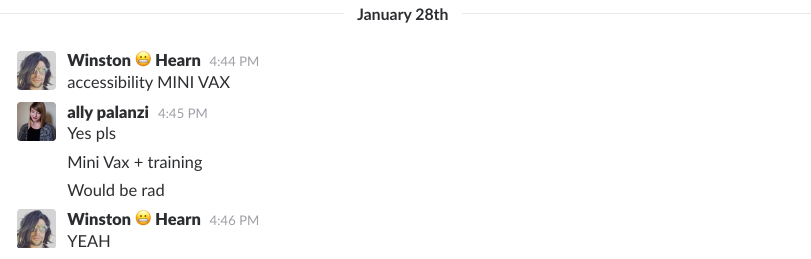
Vax 2016!
2.5 days figuring out the best way to open source our documentation
accessibility.voxmedia.com
Accessibility best practices* for designers & developers
*Not all, but some good ones.
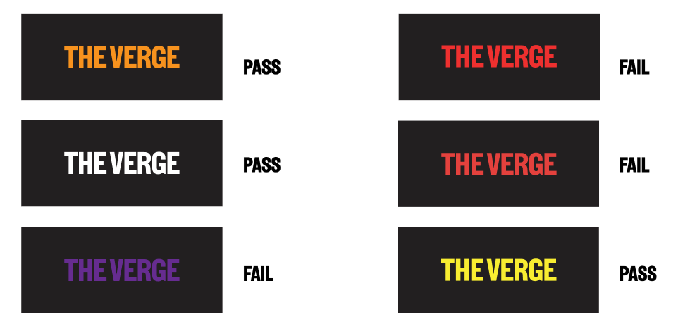
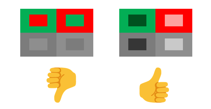
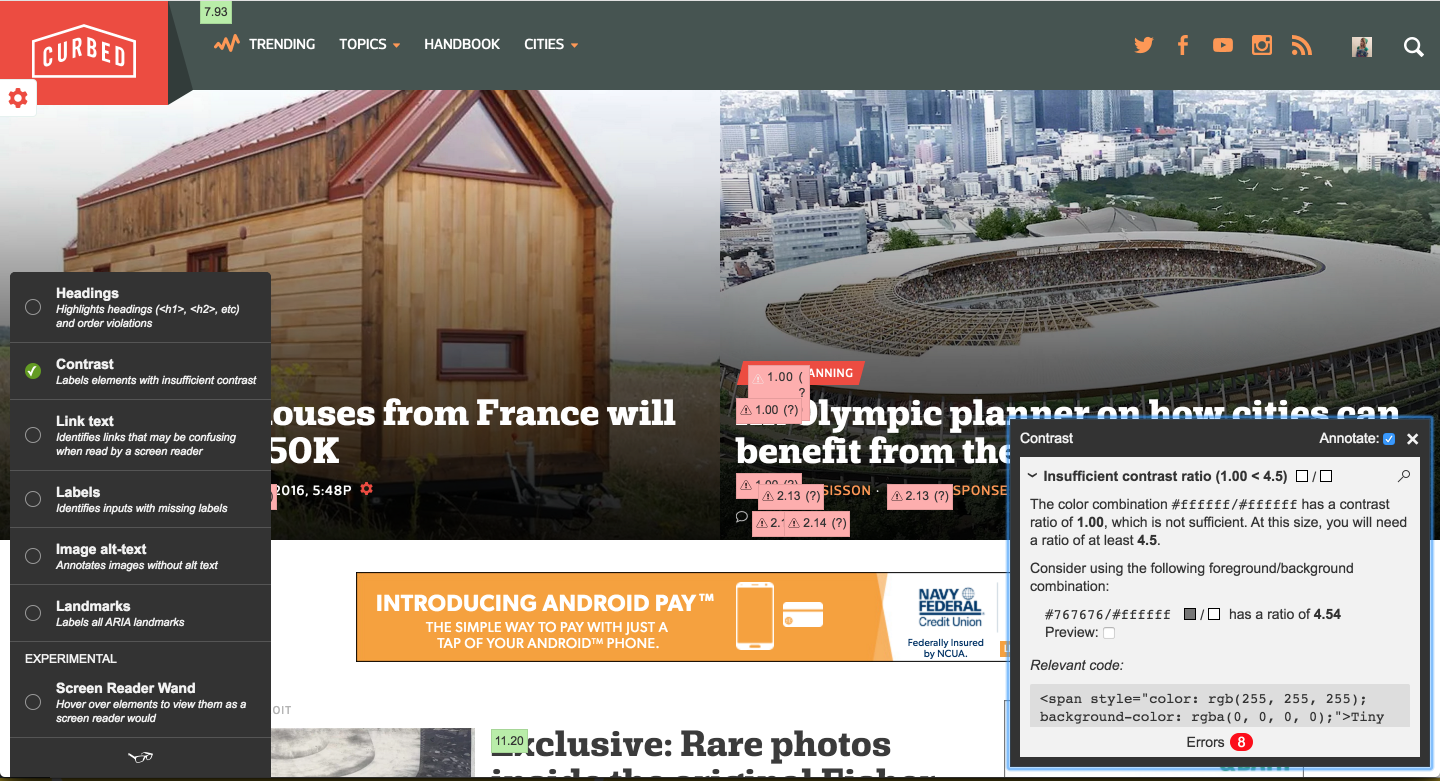
Make sure there is enough contrast between text and its background color.

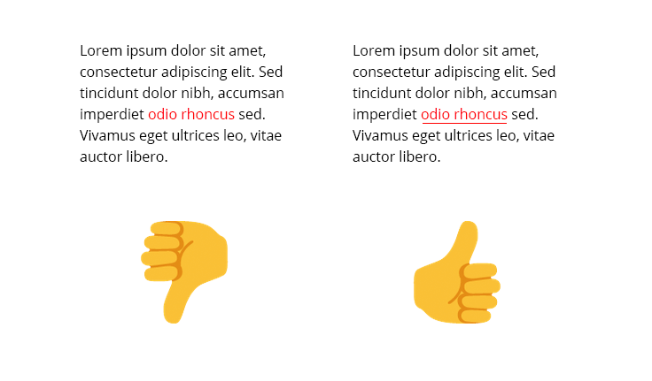
Don't indicate important information using color alone
Pair values of colors together (not only hues) to increase contrast
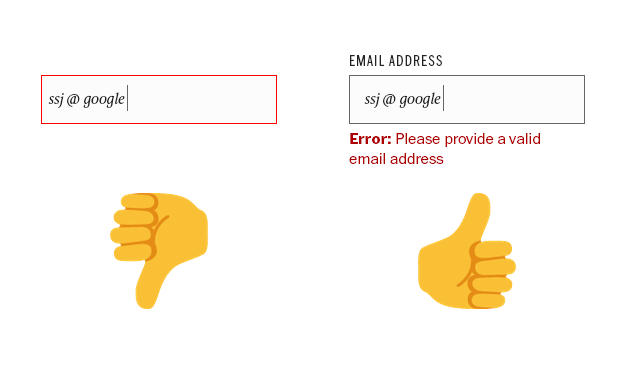
Design accessible forms
Fields should have labels that are always present, error messages should be clear
Build accessible forms
- Always have labels, don’t rely on placeholder text
- Labels should not disappear on form focus
- Use fieldset and legend for larger forms like a checklist
<label for="name">Name:</label>
<input id="name" type="text" name="name">

<fieldset>
  <legend>Select your pizza toppings:</legend>

  <input id="ham" type="checkbox" name="toppings" value="ham">
  <label for="ham">Ham</label>
  <input id="pepperoni" type="checkbox" name="toppings" value="pepperoni">
  <label for="pepperoni">Pepperoni</label>
</fieldset>
Use semantic HTML
- Limit div soup, strip unnecessary HTML elements
- Use headings
h1-h6for content structure - Avoid skipping headings in the same sections
- It’s okay to have multiple of the same heading on a page.
<html lang="en">
 <head>
  <title></title>
 </head>
 <body>
  <header></header>
  <nav></nav>
  <section></section>
  <article></article>
  <aside></aside>
  <footer></footer>
 </body>
</html>
HTML Landmarks
- These landmarks help define specific areas that a user might want to seek out and can save them a lot of time.
<header>for role="banner"<main>for role="main"<nav>for role="navigation"<footer>for role="contentinfo"<aside>for role="complementary"
HTML document should have a language attribute
<html lang="en"> </html>
Focus States
- NEVER remove focus states from elements
- Design better ones or leave them as-is
- These should not be subtle – they should stand out so users can tell what item they are tabbing to
*:focus {
 outline: none; //BAD!!!
}
Know when to use buttons vs. links
- Linking to something outside the page? Use an anchor tag.
- Performing an action on the page? Use a button.
Make links descriptive
- “click here” vs. “click here to read more about Vox Media”
- This is also helpful for SEO!
Write good alt text for your images, hide decorative images
<img src="catomg.jpg" alt="cute fluffy cat">
<img src="border.png" aria-hidden="true">
Accessible Inline SVGs
SVGs are often used as icons on interactive elements in sites. The SVG should have a title or description, then you can use the aria-labelledby attribute to tell the screen reader what element to use to describe the SVG.
If an experience cannot be made accessible, create another route for assistive tech.
Maps, charts, graphs might be more accessible as HTML tables.
Allow viewport zooming
Support keyboard navigation
- Users should be able to tab through the entire page
- Don’t allow “keyboard traps”
Accessibility is everyone’s responsibility
- Don’t hesitate to push back on inaccessible designs
- Semantic html goes a long way
- Don’t change default semantics
Okay this sounds like a lot. How do I test it?
Testing best practices
- Navigate the page with your keyboard
- Add accessibility to your project checklist just as you would any other function or feature.
- Include a11y in your device/browser QA process
- Test early and often!
Tota11y bookmarklet
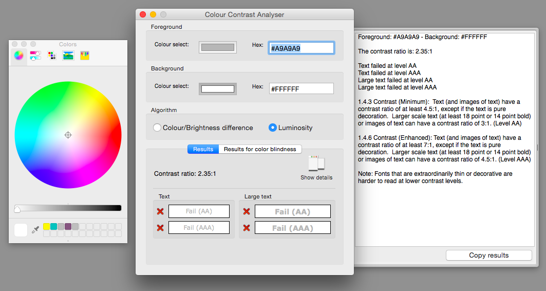
Colour Contrast Analyser
RECAP!
Disability affects everyone.
Trouble getting buy in?
Ask for forgiveness later.
Baby steps count, it’s not going to happen all at once.
Think about accessibility
early & often.
Semantic HTML + browser defaults go a long way.
Let’s make our work better!
Tools & Resources:
Thank you!
#cssconfau16